They had spreadsheets because the software lied
Three years. One client. Two products that couldn't be more different on the surface.
ISS is one of Europe's largest facility services companies — cleaning, catering, and workplace operations across thousands of office buildings. I came in as an external product designer in 2022. The brief was narrow each time. The underlying problem was not.
The catering app nobody ordered from
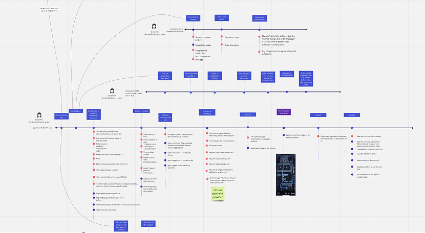
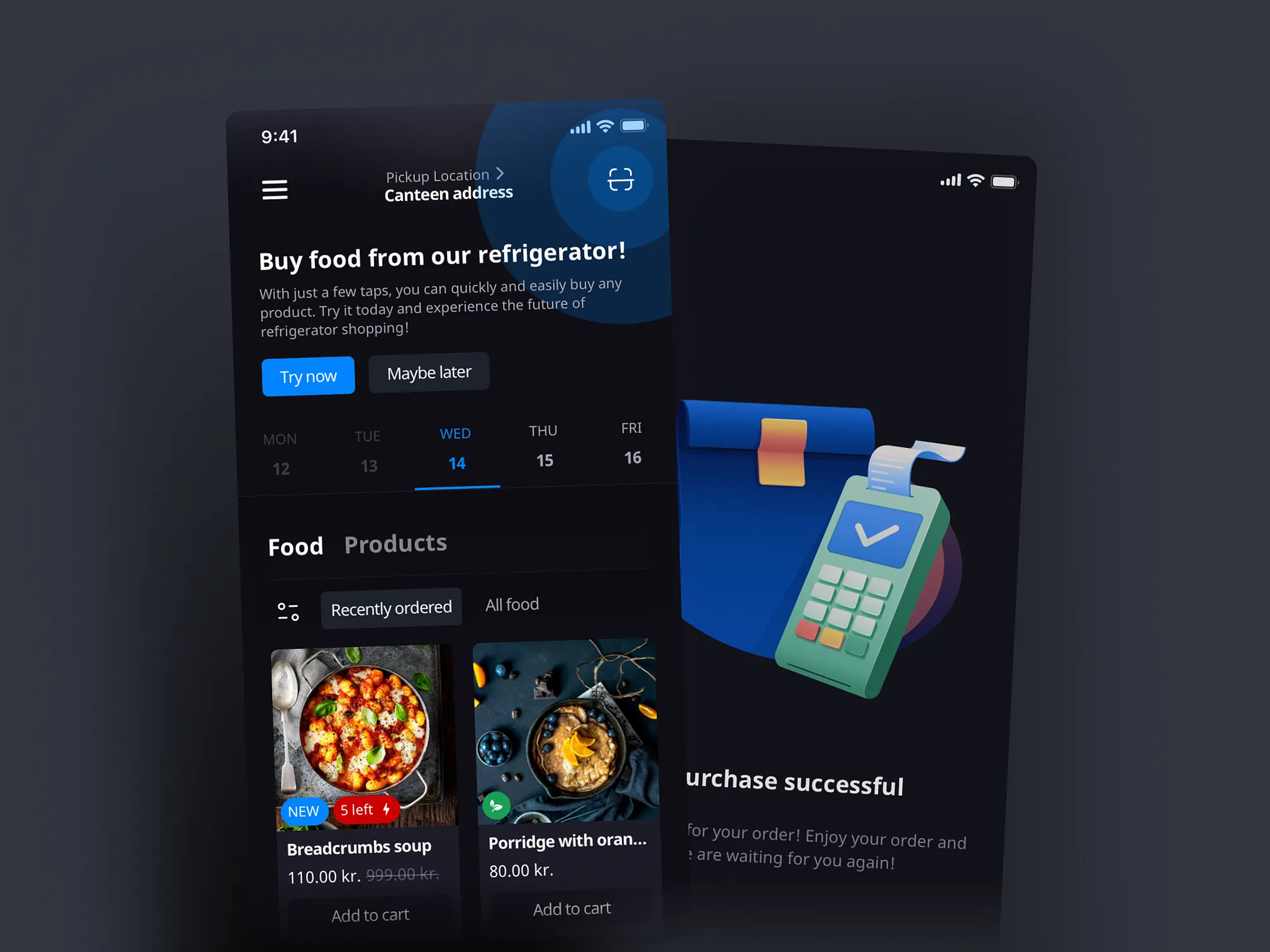
ISS Takeaway was supposed to be simple: employees order lunch, kitchen prepares it, everyone's happy. The legacy web system had been running for years. It had a menu, a cart, a checkout flow. It was technically functional.
It was also losing users.
I spent the first week not touching the interface. I talked to two fulfillment workers, one kitchen administrator, and a handful of customers. What I found: 85% of refund requests traced back to a single cause — inventory mismatches. An employee would order something, the kitchen would cancel it, and the employee would have to start over. The inventory wasn't live. Stock was updated manually. By the time an order was confirmed, the item might already be gone.
The system was lying to users at the worst possible moment — after they'd already committed.
Once you see the root cause, the solution stops being a UX problem and becomes an infrastructure one. The redesign required bidirectional sync: orders and kitchen stock talk to each other in real time. No more manual updates. No more surprise cancellations.
The interface followed from that constraint. If the system is honest about what's available, you can simplify everything else:
- Mobile-first layout (90% of orders happened on phones — the web app was a workaround, not a choice)
- Four-stage order tracking: Pending → Preparing → Ready → Picked Up
- Quick Reorder, added after the second usability test when we watched three separate users navigate to the same item every single day
First month after launch: orders doubled. Daily active users up 60%. Refund requests dropped 80%. Kitchen staff onboarding time cut in half. Three months later, the service expanded to additional corporate locations.
The numbers look clean in a case study. They were the result of fixing something that should have been fixed years earlier — the software had stopped being the source of truth, and users had stopped trusting it.
The operations platform managers worked around
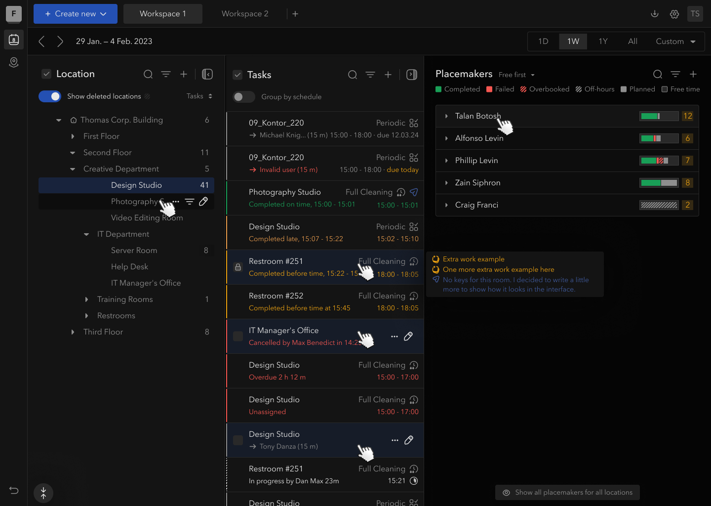
Pure Space is ISS's platform for cleaning managers. Where Takeaway was a contained consumer product, Pure Space was a dense B2B system that had grown for years without a coherent design layer.
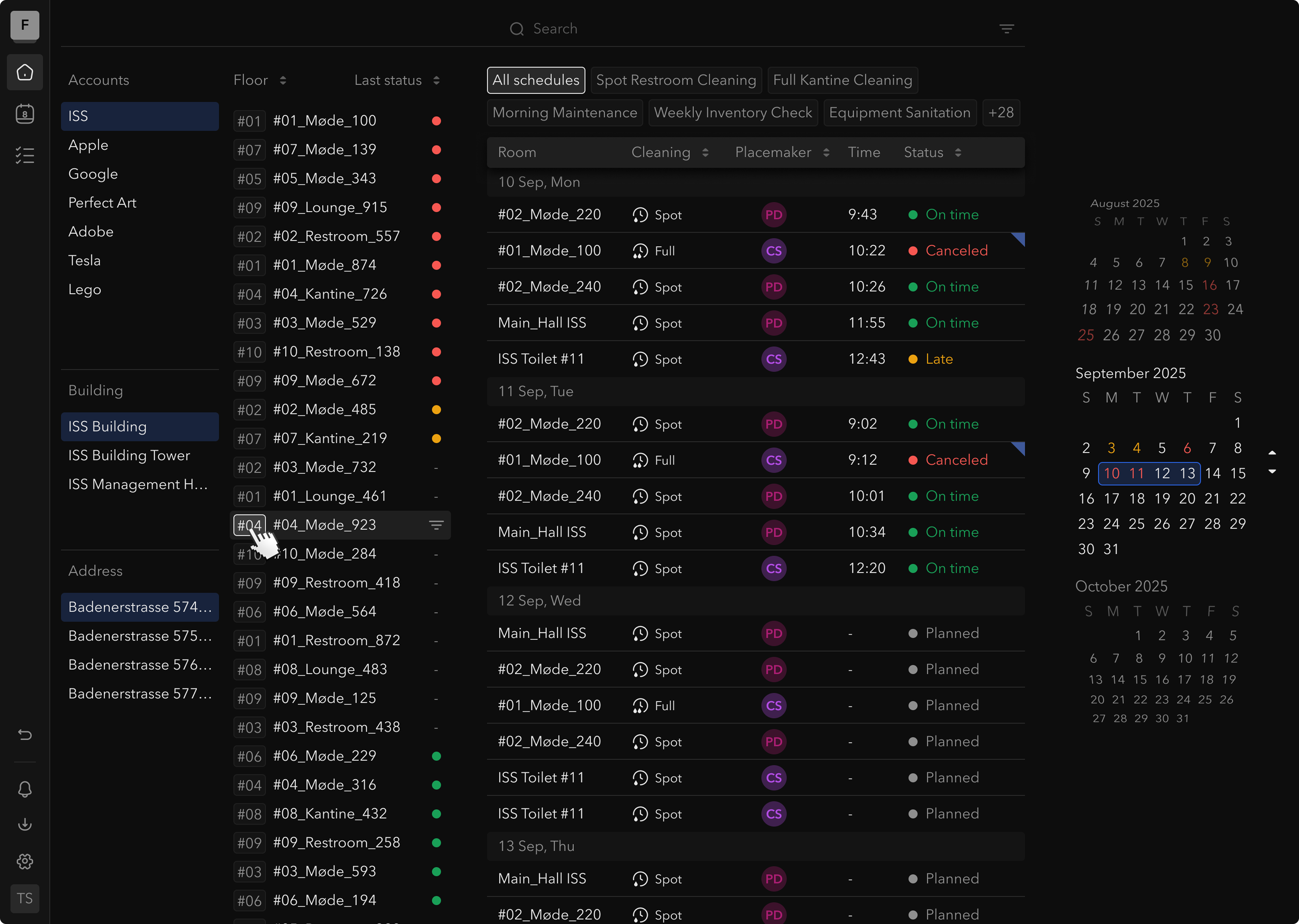
When I started the dashboard redesign, the situation was this: to see the cleaning status for a specific room, a manager needed to navigate five levels deep — Company → Region → Building → Floor → Room. The timeline showed one fixed week with no flexibility. Critical failures and completed tasks looked the same. There was a global search, but results came back unfiltered across the entire hierarchy.
The people using this every day had found workarounds. Spreadsheets. WhatsApp groups. The platform existed, but it wasn't where real coordination happened.
The hardest part of this project wasn't the design. It was accepting what wouldn't change.
The constraint was clear: use 90% of the existing component library. No visual overhaul. No new navigation patterns that require retraining hundreds of managers. The question became: what's the smallest change that would make people stop using the workarounds?
Three interventions that moved the needle:
One-click location filters replaced the five-level tree. The hierarchy is still there — it just doesn't stand between you and your data. Pick a building, see that building.
Live color-coded timeline with smart sorting — incomplete cleans float to the top automatically. The thing you need to act on is visible without scanning.
Granular revision targeting in the survey module. Previously, editing a shared question would silently update every survey referencing it. Teams had learned to duplicate questions instead of editing them, creating reporting noise across the platform. The fix: when saving a revision, you choose exactly which surveys it applies to, with historical data protected by default.
One thing I'd change: I'd push harder on the failure pattern calendar. We added a view that surfaces recurring cleaning failures by location and time — the managers who found it consistently called it the most useful thing in the platform. Most never clicked it. That's a discoverability failure, and it's mine.
What both projects taught me
Takeaway and Pure Space were structurally different products. Different complexity levels, different user types, different technical stacks. But the diagnostic question was identical:
Who has information the user needs — and why isn't the user seeing it?
In Takeaway, the kitchen had real-time inventory data. The user had none of it. In Pure Space, the platform had cleaning status data. The manager had to dig five levels to find it.
When users stop trusting a system, you're not solving a UX problem. You're rebuilding credibility. And credibility only comes from the system being honest — consistently, before the user has to ask.